checkoutflow header graphic

Improving Customer Onboarding

Reducing friction throughout onboarding flows in order to increase conversions.

Project Overview

My role

Project Owner
Design Lead
UX Researcher
UI Designer

Teams

Product Manager
Web Developers
Internal Ops

Duration

3 months

Overview

For this project, my team and I were tasked with optimizing the checkout flow on our main website for our SaaS product, Bluon for Business, to address several key business objectives. These objectives included increasing revenue, improving conversion rates, and generating leads from users who chose not to complete their checkout. The existing flow was functional but lacked optimization for a streamlined, intuitive user experience, resulting in cart abandonment and missed opportunities to engage potential customers.

Our potential customers are HVAC contractors, generally male, anywhere in the age range of 30s to 60s. They are business owners in an industry that is very under-serviced as far as tools, very seasonal (although still needs to function year-round), and unforgiving. These people understand the importance of quality service and value a tailored experience.
Initial Challenges

running emoji

Friction led to High Abandonment Rates

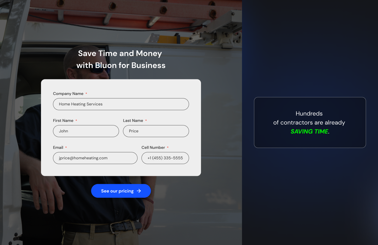
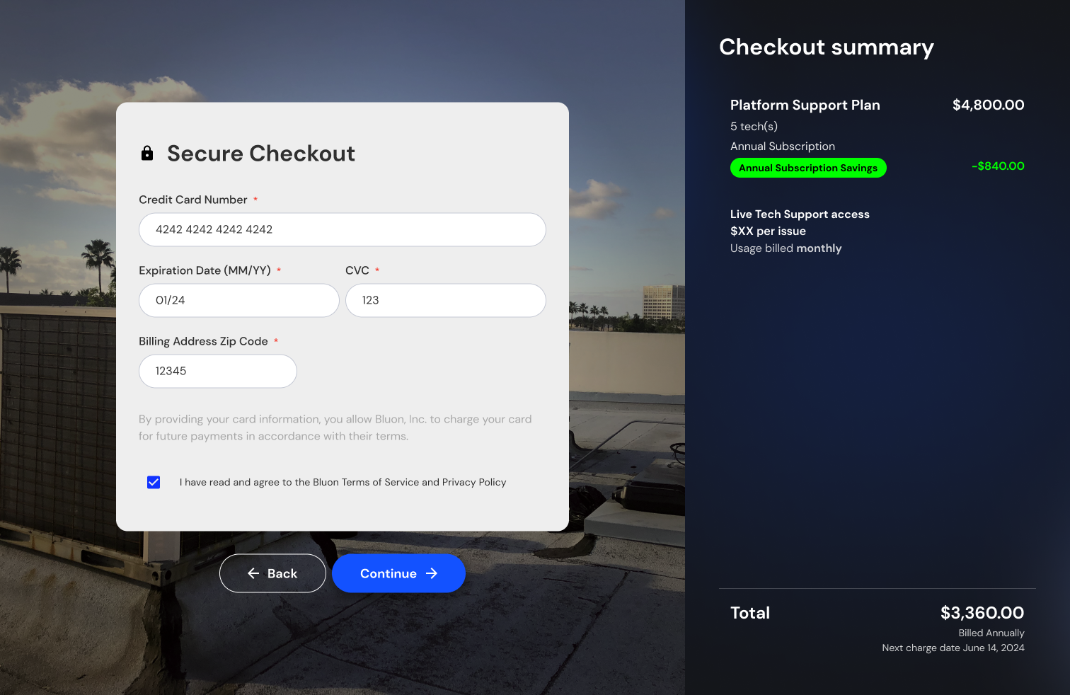
Since users were leaving at critical steps of the checkout, such as during the payment phase, we minimized friction and removed unnecessary steps, resulting in a more seamless user experience. The previous flow had multiple steps and asked for too much information upfront, overwhelming potential customers. To solve this, we reduced the amount of fields the user would have to enter in order to sign up by over 50%.

waving emoji

Poor Process for Re-Engagement

Since there was no mechanism to re-engage users who abandoned the flow, there was a ton of lost opportunities for follow-ups. To solve for this, We decided to collect contact information at the beginning of the flow that makes re-engagement a lot easier if they fall off anywhere after that step.

waving emoji

Pricing Display was Confusing

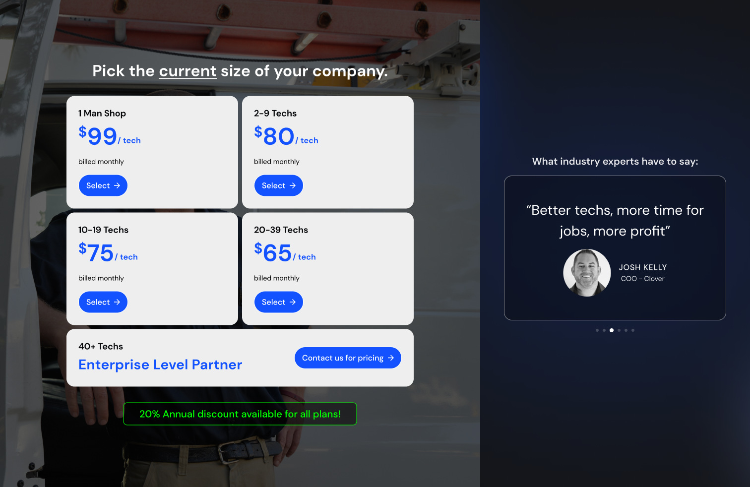
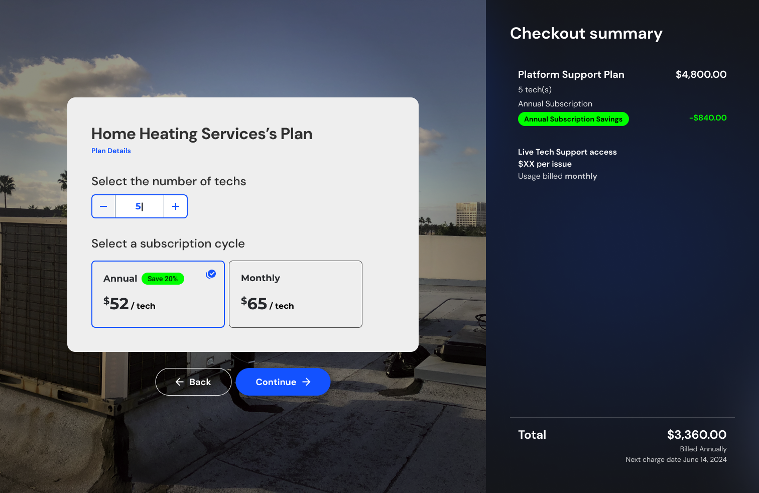
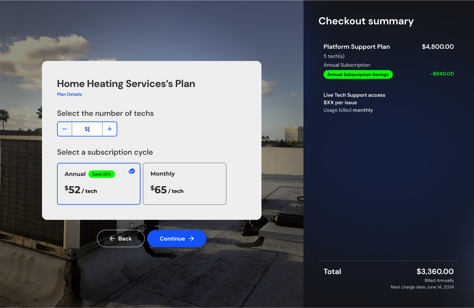
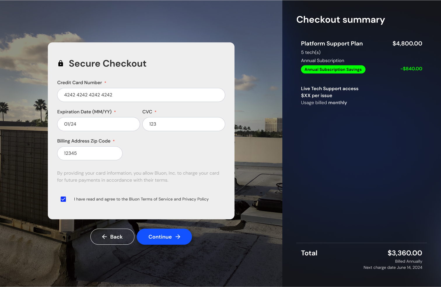
The previous flow had a very confusing and distracting way to display pricing and future charges. To solve this, we created easy-to-understand ledger-style summaries surrounding the pricing and charges, making it extremely clear when and what they will be charged.

Initial Designs

View of the model profile

So why was this not the final solution?

New Challenges

thinking emoji

Unqualified leads

We had quite a few "tire-kickers" who wanted to sign up for a free trial and cancel before it was over and then continue trying to sign-up on different accounts

thinking emoji

Lack of customization

Contractors and other potential clients were accustomed to custom pricing and a more tailored onboarding process. Without engaging with potential customers, prospects could not get specific questions answered or receive tailored information for their needs leading to them users not being "bought-in".

thinking emoji

High obligation risk

Potential customers had apprehensions about buying a product before seeing it work and not having clear understanding of the product's benefits.

Final Solutions

To combat the new set of problems we removed the ability to sign up directly from our website without getting a demo first. When landing on the product page you would see the single option of "Get Demo".

At a glance this seemed like a terrible idea - we started the project with the mentality to remove as much friction as possible, and roadblocking our sign-ups with a one-on-one demo is going in quite the opposite direction. However, all of our "new problems" did not exist where we had some human interaction. Being able to have a "nurtured" experience solves all of these issues.

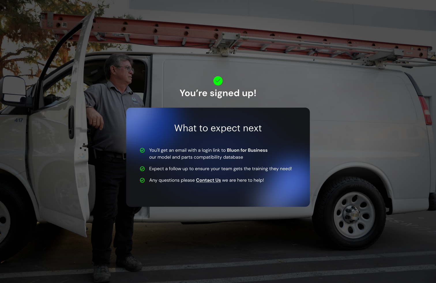
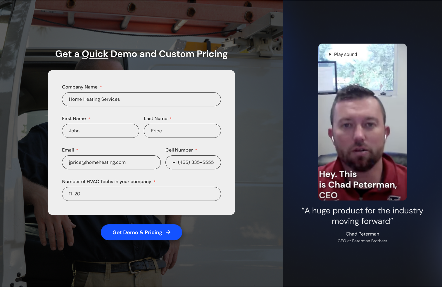
checkout flow

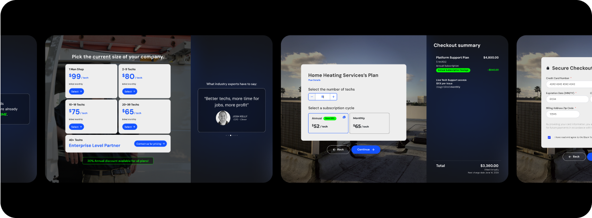
For the new solution we would guide users into booking a demo, entering the same introductory information as the previous solution - once one of our representatives had the opportunity to meet with them, answer any specific questions, and identify whether or not our product is right for them, we would send them a link. From there that link would open a direct checkout where they would be able to confirm any information previously entered, review their tailored plan and confirm billing cycle, and enter their credit card information.

Final Designs

View of the model profile

Key Metrics in the first month post launch

25%

Decrease in user complaints regarding confusion on pricing. User feedback showed a clearer understanding of the new pricing model, with minimal complaints during the transition period.

14%

Increase in sign ups from previous solution. Cart abandonment went from 63% to 49% within the first month of launch.

300 +

Leads generated from users who did not complete the checkout process with a 54% success rate in lead to deal conversion..

$56k

Increase in Annual Recurring Revenue within the first month of launch of the new checkout flow.

Let's work together

Email

brian@brianprouty.com